Map of World US Population Shift (2000-2010)
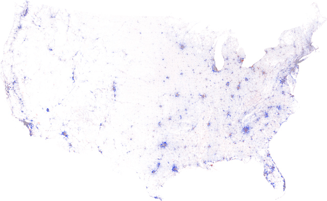 The above map shows changes in population density from the 2000 Census to the 2010 Census. Areas that are deep blue show significant increases, red areas show significant decreases, and grey areas show no/little change (1). The map is not only interesting for its data, but also graphically beautiful. Below, there is a detailed area of the same map showing the Detroit area.
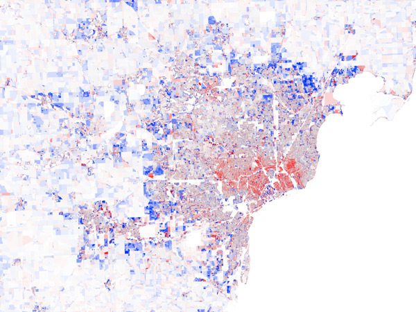
Map of World Inventions/Attractions
The second map I found interesting was this graphic interpretation of a World map. This map is more expressive and personal, showing important inventions or locales of certain areas of the world, rather than being a tool for navigation (2). The images are also expressive, giving a feeling of what the different areas of the world might be like, something a normal street map can't usually do.
The map, however, is still educational, and one can learn a lot by looking at it. I think that an average person would likely spend more time looking at this map than at a typical world map!

Map of Mouse Movement
The map below departs from World geography and moves on to the geography of the computer screen. This map is created from data of a users mouse movement over 3.9 hours playing a video game on a computer (3). The resulting data-informed image is almost a piece of abstract art, beautiful, and clearly full of significant areas of activity. We are moving into an age in which human activity is becoming completely track-able, and we soon may see such visualizations of many aspects of our daily lives, from our activity (walking, typing, dancing, running, etc), to our daily spending. Regardless, I think that the map below is simply very cool to look at and I would be interested what kind of map is generated from my time on the computer.

Citations
1) Von Worley, Stephen . Growth Rings Maps Of U.S. Population Change, 2000-2010. 2011. Map. Data PointedWeb. 2 Oct 2012. <http://www.datapointed.net/2011/04/maps-us-population-change-2000-2010-census/>.
2) Gatley , Owen. The Times. 2011. Photograph. Owen Gatley, Berlin, Germany. Web. 2 Oct 2012. <www.owengatley.co.uk/The-Times>.
3) Limer, Eric. What 3.9 Hours of Mouse Movement in Minecraft Looks Like. 2011. Photograph GeekoSystemWeb. 2 Oct 2012. <http://www.geekosystem.com/minecraft-mouse-map/>.
No comments:
Post a Comment