Tuesday, November 27, 2012

Lab 8 - LA County Station Fire (Patrick Chew)

The 2009 LA County Station Fire

The LA County Station Fire started on August 26, 2009 and was not fully contained until October 16, 2009. The fire has been attributed to arson. The Station Fire burned through approximately 160,577 acres and destroyed over 200 structures. The extent and duration of the fire was remarkable and threatened nearly 12,000 structures, while mandatory evacuations affected many nearby communities. During the nearly two months that the fire burned, more than $93.8 million dollars were spent on containment. The fire was the 10th largest in California history and the largest in the history of LA County. I am from Orange County and can specifically remember the sky becoming dark and ashes raining down from the sky for a few days on end. It was eerie. Sports games were canceled, events were rescheduled, and for a few days, it was rumored that school might even be canceled for a day. This experience made studying the spread and effect of the Station Fire all the more interesting.  


First, I created a reference map which tracks the spread of the fire for 5 days. As we can see on the map above, the fire spread rapidly from August 29th to the 30th and continued expanding, slowing down a bit in the last day mapped, Sept. 2. The fire was 93% contained by September 18th but small pockets of forest continued to smolder and burn until mid-October.

I was interested in studying the effect of the forest fire on wildlife habitats inside LA County and found the Significant Ecological Area (SEA) classification to be a useful metric for measuring this. SEAs are classified by the LA County Department of Regional Planning as areas which contain important "land and water systems that support valuable habitat for plants and animals," (LA County) especially animals which are rare, threatened or endangered. SEAs are not wildlife preserves or National Parks in any sense, but are areas deemed by the county to demand special care when considering development and conservation. The SEAs in LA County are incredibly diverse. They contain some flora and fauna which are not only exclusive to the Southern California area, but exclusive to LA County itself. 


As we can see in the map above the Station Fire threatened but did not enter SEAs on the Northern and Southwestern border of the fire boundary, including areas such as the Santa Clara River, Tugunga Valley, and the Verdugo Mountains. We are very lucky that these areas were not affected and will have to continue to keep a careful watch on them in the future. Firefighters likely employed a containment strategy that took into account the location of these SEAs as well as the locations of surrounding communities and other important areas. Although no SEAs were directly affected by the forest fire itself, debris, smoke, ash, and other factors likely affected the bordering SEAs, and because of this, we will need to keep a close watch on the flora and fauna in these areas. 

The Station Fire caused incredible damage to a huge area within LA County and its costs are still felt across the county and the state today. Forest fires not only release an incredible amount of smoke, soot, ash, and many chemicals into the air, they help spread harmful bacteria and fungi, and can also aggravate soil conditions. Despite these, forest fires are actually a natural part of forest ecosystems. They help clear out dead plants, reveal mineral soil, and clear canopies so sun can penetrate dense forests, among other things. However, because of our fire management strategies and our incredible fear of large fires, we face a dilemma in fire suppression. The more we put out small, naturally caused fires inside our ecosystems, the more likely that huge fires like the Station Fire will catch us by surprise. Although the Station Fire was caused by an arsonist, it certainly urges us to evaluate our fire management strategies, as fires are a common occurrence in dry California. 

Works Cited

California. Angeles National Forest . Station Fire. Los Angeles: , 2009. Web. <http://www.inciweb.org/incident/1856/>.

"Ecological Consequences of Forest Fires." RiaNovosti. RiaVovosti, 9/12/2011. Web. 8 Dec 2011. <http://en.rian.ru/infographics/20100804/160063455.html>.

Michon, Scott "Station Fire Burn Scar" Nasa Earth Observatory. NASA, 18 Sept 2009. <http://earthobservatory.nasa.gov/NaturalHazards/view.php?id=40245>

              Plambeck, Lynne. "Significant Ecological Areas in the Santa Clarita Valley." Significant Ecological Areas. SCOPE, 2010. Web. 8 Dec 2011. <http://www.scope.org/sea/index.html>.

              "SEA Program" Los Angeles County Department of Regional Planning. 2009.
<http://planning.lacounty.gov/sea>


Wednesday, November 21, 2012

Lab 7 - Week 8 (Patrick Chew) - U.S. Census Maps

 
Using U.S. Census Data to Create Maps:

This week we worked with data directly from the 1990 and 2000 U.S. Census. I thought it was pretty insightful and realized that there are so many possibilities for the information that is collected in the census. My dad is a demographer, so since I was young I was surrounded by references to the census, whether U.S. Census post-it notes or some project my dad was working on. The census is an incredibly powerful tool that helps us understand the current state of things in the U.S., and even more importantly, when compared to other data, where we are going in the future.

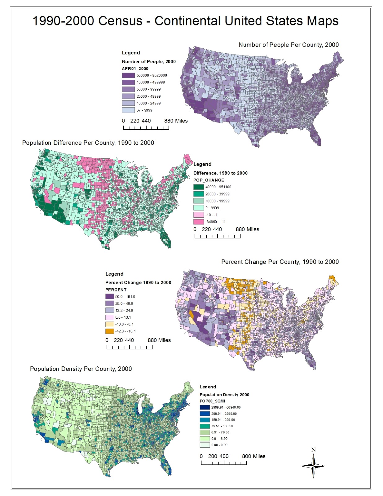
The first map shows the Number of People per County in 2000 and shows a clear trend of dense population on the coasts and increasingly less population towards the center of the country. It seems like some of the biggest concentrations are in Southern California, the Pacific Northwest (Seattle Area), the Southern tip of Florida, and the New England area. What is also an interesting trend for all four of the maps is that the county sizes on the East side of the country are much smaller than those on the West side. This means that if the population per county is comparable, the density in an East coast county would likely be greater (though not always true). If anything, this map helps illustrate how the American population has, over the years, spread itself from the East coast to every corner of the country. 

The second map shows changes in county populations from 1990 to 2000, and again we see a significant difference between the middle of the country and the coasts. From 1990 to 2000, we see an incredible change in population as people move from Middle America out towards the surrounding areas, especially the coastal areas (Maine excluded). Although one can't necessarily tell from just this map, I think the movements are likely also related to urban vs. rural areas, as individuals are probably migrating towards urban areas. States like California and Florida are largely green, showing great population increases in those states over the ten year period. 

The third map shows the percent change per county from 1990 to 2000. We see a similar story to the second map, but the narrative is different. I think that mapping the percent change per county perhaps focuses more on each individual county or groups of counties because we see that some of the counties in dark mustard yellow have decreased between 10 and 42.3 percent over the ten year period. Why is this? Can we find other census data that correlates with these massive decreases? Per capita income? Cost of living? These maps are truly captivating because they don't just show us what is happening, they also bring up a lot of questions and help us analyze the state of the union. 

The fourth and final map illustrates the population density per county in 2000. It looks like some of the most consistently dense counties are on the Northeast coast and up near San Fransisco. This map paints a different picture than the first map of number of people per county. As an example, when I looked at the first map, I talked about huge populations in Southern California. While this may be true, counties like Los Angeles County are huge in area and as a result, are not that population dense. Comparing this map and the first map emphasizes the idea that we need to make sure we understand exactly what kind of map we are looking at because slightly different data can paint very different pictures of the continental United States. 

This may have been my favorite lab so far because it showed us how to tap into the massive resource that is the U.S. census. I think that as a designer, I will be able to use census data for data visualization or research. The map exercise illustrated that we must carefully pick our data as well as our aesthetic language to show exactly what we want to show because there are countless variations. As viewers, we must also be careful to make sure we understand what exactly we are looking at. As I said before, the map exercise creates many questions, and I think these questions (Why are they moving towards the coasts? Why are these counties the densest? Why do we see population percentage dips in most counties in Maine?) are the essence of why cartographers, demographers, and other people throughout industries everywhere do what they do. How can we answer these questions and come up with meaningful and applicable solutions? The Census data combined with GIS is just a starting off point for much greater exploration of the dynamics of our country.


Sunday, November 18, 2012

Lab 6 - Week 7 (Patrick Chew)

Portland, OR


I chose to create a series of maps on the Portland, Oregon area. I spent my summer at Nike, which is located just outside of Portland, so the area has a special place in my heart. Portland is full of good food and drink and has a very unique, distinctive culture. As of the 2010 census, approximately 583,776 people live in the city of Portland and approximately 2,260,000 people live in the Portland Metropolitan Area. Just outside is Portland is Mt. Hood, which hosts the only year-round snowboarding/skiing in the continental United States. The Willamette River runs straight through the center of the city. Portland is known as one of the greenest cities in the united states because of its use of public transportation and careful land-use planning. 

Extent Information: 
Top: 45.6972222221
Left: -122.850000001

Right: -122.210833335
Bottom: 45.4419444443

Spatial Reference: 
Datum: D_North_American_1983
Angular Unit: Degree (0.0174532925199433)


3D Digital Elevation Model


Tuesday, November 6, 2012

Lab 5 (Patrick Chew)

Map Projections in ArcMaps


There is a great deal to be learned from this map exercise. As we can see above, there are incredible differences between the map projections shown above, only six of MANY types of projections. The projections vary in distance, in shape, and in orientation, and these distortions can change our perception of the world around us. Equal area projections preserve area, while equidistant projections preserve distance, and conformal projections preserve angles (orientation). The map projection that a geographer ultimately chooses to use depends upon the use of the map and the message being conveyed in that map. Our lab exercise only further emphasizes that point and shows the importance of choosing ones setting's correctly. 

Conformal projections (the first set of maps) preserve angles, but there is significant distortion along the poles. For example, in the Mercator projection, Antartica is approximately the same size of all the other continents combined. While the angles remain accurate, shape and size are lost. While we are quite used to seeing conformal projections, especially the Gall Stereographic, there are some great distortions. Again, the difficulty of translating form from a 3D object to a 2D surface is emphasized.

Equal area projections (shown in the second set of maps) preserve area. However, distance, shape, and direction are quite distorted. In the Hammer-Aitoff Equal Area, the size/area of Greenland and Antartica appear to be less distorted than in the Conformal projections above, but the shape appears grossly distorted. This is even more apparent in the Cylindrical Equal Area projection, where Antartica is stretched incredibly.

Equidistant projections (the third set of maps), preserve distance from a certain reference point or reference points. In the Sinusoidal projection, the shapes near the center are somewhat accurate, but as the lines converge at the pole, the shapes of continents become distorted. In the Cylindrical Equidistant projection, the area of the countries is distorted, as is visibly evident from Africa's compression. Equidistant maps can either preserve area or shapes, but not at the same time. Although we were required to do two maps per type of projection, it would have been interesting to see even more to assess how the distortions are changed and how each can lead to a different visual language when discussing certain areas of the world. There are many types of projections possible in ArcMap, but choosing the correct one will help both the creator and the users of the map and can help advance the information and visual impact of the map itself. 


Friday, October 26, 2012

Lab 4 (Patrick Chew)

Week 4 - Introducing ArcMap/The Pitfalls and Potential of ArcMap


This week was our first venture as a class into actually using Arc GIS and the ArcMaps program. I had a mixed experience, overall finding ArcMaps to not be an intuitive program and I can see why neogeographers tend to use other software or methods to create their maps. Alternatively, even with my brief interaction with ArcMaps, I can see that the potential for visualizing data in and around geographic locations of all sorts is incredible.

My first reaction to the program was that it is not intuitive. As a designer, I am very familiar with programs like Adobe Illustrator, Photoshop, InDesign, as well as with some 3D modeling programs. These programs all deal with creating, recreating, or modifying objects, as does ArcMaps. But these programs are all more intuitive; the user does not have to click through many windows or scroll over many objects to figure out what they want to do. More importantly that this, in the above listed programs, the user can play around. I think that the inability to just play around, tinker, and see what happens, is what makes ArcMaps unappealing to the common user and neogeographer.

Conversely, as a professional program, ArcMaps has incredible potential. The ability to combine data in multiple layers is remarkable and even more complex than Prof. Illes described. Through ArcMaps, one does not only get an accurate idea of geographic information, but also any data that can be associated with those locations. Despite the difficulty in creating and displaying these layers, the final product that we created was quite impressive. Arc GIS is clearly a pivotal tool for all sorts of disciplines and, as Prof. Illes said, a remarkable tool for persuasion and argument.

I will do my best to learn ArcMaps during the remainder of the class because I feel that it is a program with great potential and hopefully I can use it in some sort of design projects as well. However, I think moving forward, it would behoove the esri developers to work with designers of programs like Photoshop to create an interface that is easy to use both at the amateur and professional level. I feel like I literally just followed the tutorial step by step, but if I were to try it on my own, I would get nowhere. If ArcMaps were a more fun and intuitive tool to use, I think it would be far more popular. 


Tuesday, October 16, 2012

Lab 3 (Patrick Chew)


View Night Markets in Taipei in a larger map

My map above details some of the most famous locations for street food and street shopping in Taipei, Taiwan. Taiwan is famous for its xiaochi, or small snacks, of which there are hundreds to choose from, from fried, to grilled, to soft, crunchy, and more. 


Neogeography: Benefits and Pitfalls

Neogeography is a term used to describe the use of geographic tools for personal or community use by non-professionals. In the Internet age, the use of neogeography has greatly expanded due to greater access to information as well as to geographic tools. Neogeography is incredible because it brings individuals closer to the locations in which they live and to the geography of the Earth.

Many geographers and other professionals argue that neogeography is going to be the downfall of GIS and of professional geography, desperately hoping to distinguish their work from the work of novices on platforms such as Google Maps. To some extent, it seems that neogeography has slightly diluted traditional map-making. We are now surrounded by maps of our friends’ favorite eateries, maps of election data, twitter data, and everything in between, all made by ‘amateurs’. Because of this, there is less regulation of the data that we see, and agendas are not as clear to the average viewer. 

Thursday, October 11, 2012

Patrick Chew - Lab 2


Week 2 Lab

1. The Quadrangle featured in the map is the Beverly Hills Quadrangle.
2. The adjacent quadrangles are: Canoga Park, Van Nuys, Burbank, Topanga, Hollywood, Venice, and Inglewood.
3. The quadrangle was first created in 1966.
4. The datum is from the North American Datum of 1927 (NAD 27). The North American Datum of 1983 (NAD 83) is also depicted by dashed corner ticks.
5. The scale of the map is 1:24,000 (1 inch on the map is equivalent to 24,000 inches on the ground.
6.
a.     5 centimeters on the map is equivalent to: 1200.9 meters.
                                               i.     5 cm = 1.97 in inches on the map = 47280 inches on the ground = 4,000 ft.
                                              ii.     3940 ft x 0.3048 = 1200.9 meters
b.     5 inches on the map is equivalent to: 1.894 miles.
                                               i.     1 mile = 5280 ft = 63,360 in on the ground
                                              ii.     5 in = 120,000 inches on the ground/63,360 = 1.894 miles
c.      1 mile on the ground is equivalent to: 2.64 inches on the map.
                                               i.     1 mile = 5280 ft = 63,360 in on the ground
                                              ii.     63,360 in/24,000 in = 2.64 inches
d.     3 km on the ground is equivalent to: 12.49 cm.
                                               i.     3 km = 3000 m = 300,000 cm.
                                              ii.     5 cm on map = 1200.9 = 120,090cm/5 =24,018, so 1 cm on map = 24,018 cm on ground.
                                            iii.     300,000 cm/24,018 cm = 12.49 cm on map
7. The contour interval on the map is 20 feet. Supplementary contour interval is 10 feet.
8. The approximate geographic coordinates in both degrees/minutes/seconds and decimal degrees of the
e.     Public Affairs Buildling:
                                               i.     DMS: 34°04'26" N and 118°26'21" W
                                              ii.     DD: 34.07398° N and 118.43923° W
f.      The tip of the Santa Monica Pier:
                                               i.     DMS: 34°0’26” N and 118°30’3” W
                                              ii.     DD: 35.00732° N and 118.50073° W
g.     The Upper Franklin Canyon Reservoir:
                                               i.     DMS: 34°7’18” N and 118°25’33” W
                                              ii.     34.12175° N and 118.40907° W
9. The approximate elevation in both feet and meters of:
h.     Greystone Mansion (in Greystone Park): 560 feet = 170.688 meters
i.       Woodlawn Cemetery: 140 feet = 42.67 meters
j.       Crestwood Hills Park: 630 feet = 192.02 meters
10. The UTM zone of the map is UTM Zone 11S
11. The UTM coordinates for the lower left corner of the map are 3763000 and 362000.
12. There are 1,000,000 square meters contained within each cell (square) of the UTM gridlines.

13. See Image Below:


14. The magnetic declination of the map is 14 degrees east of north.
15. The water in the intermittent stream between the 405 freeway and stone Canyon reservoir flows from North to South.